


#2. Leading Industry
Guiding Equity Selection

In the previous articles, we defined an uptrend, learned to identify our market, and learned to identify our time frame. These are the building blocks for equity selection. The next step is to try and figure out which stocks to buy within our market and time frame.
How Do I Know Which Stocks to Buy?
Have you ever had trouble identifying which stocks to buy? Or maybe you owned a stock that went nowhere for months while it seemed like almost every other stock was going up?
That’s where leading industries come in.
The Best Performing Stocks. Period.
The best performing stocks each year, usually come from the same industries.
Don’t believe me? Check out this Finviz scan. It finds a list of stocks that are up 500% or more within the past year. Currently, there’s 75 stocks on this list. If you filter by industry you find the following:
7 of the 75 stocks were Specialty Retail
7 of the 75 stocks were Oil related
6 of the 75 stocks were Biotechnology
6 of the 75 stocks were Software related
4 of the 75 stocks were Diagnostics & Research
These 5 leading industries made up 30 of the 75 stocks or 40%.
If you identified these 5 leading industries you’d already be heavily skewing the odds on your side of owning a stock that will outperform the market, and likely by a wide margin.
Rotation
As seen by the Finviz scan, leading stocks move in tandem to provide outsized returns, but not all stocks go up and down at the same time. A lot of industries will have inverse correlations. For example, Software may go up while Financials go down. This sporadic movement can frustrate many investors and traders. As a matter of fact, this sporadic movement has been coined rotation and is the life blood of bull markets.
This rotation doesn’t have to be random and sporadic. A lot of the time, industries will move in accordance with their relative basis uptrends or downtrends.
What’s relative basis?
Relative basis compares an industry’s performance to the performance of the $SPY. See below, a weekly chart of $XHB / $SPY. The $XHB / $SPY is a relative basis chart and compares the performance of the Homebuilders ETF to the SP500. The chart is rising if $XHB is outperforming the $SPY and falling if $XHB is underperforming the $SPY.
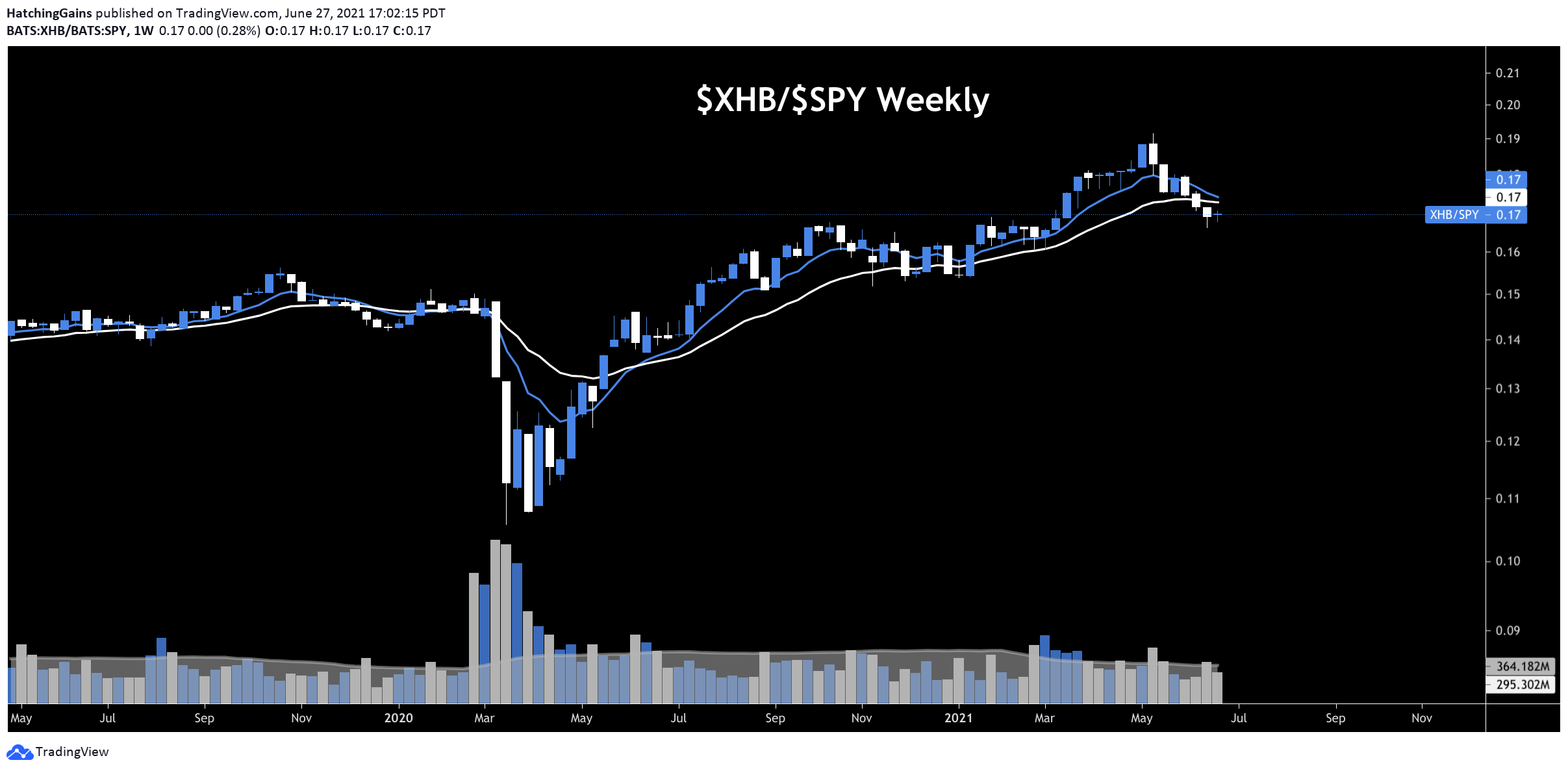
I want to own industries and thus stocks that are outperforming the SP500. If an industry and stock isn’t outperforming the most common market, $SPY, than you’re better off just buying the $SPY and saving yourself a ton of time and energy.
Being able to identify which industries are outperforming the $SPY by using relative basis charts will be a guide for individual stock selection.
How to Identify a Leading Industry by Using Relative Basis Charts
Many services and investors simply use past price performance to identify which industries are leading. This can be a good way to identify which industries are leading, but not a great way.

By only using past price performance, you may miss out on the inflection points that occur as an uptrend is ending that could lead to a downtrend and when a downtrend is ending that could lead to an uptrend. That’s where relative basis charts come in.
We can combine the past articles of identifying what an uptrend is from a technical analysis perspective (higher highs + higher lows) and industry relative basis charts to find powerful trends.
Let’s dive in.
Charting Industries on a Relative Basis
To identify which industries are leading, I add over 100 of them on a watchlist in Tradingview and put them over the SPY. To do this, simply hardcode an industry ETF / SPY and hit “enter”. For example “IGV/SPY” + “enter”. Putting an industry over the SPY is what I call an industry relative basis chart. If you want my full list that is importable into Tradingview download this Google sheet as a .csv.
By using the industry relative basis chart you are visually able to see which industries are outperforming the SPY and thus leading. In order for the relative basis chart to go up and to the right, the industry not only needs to go up on a % percentage basis, but also go up at a faster % than the SPY.
If the industry is going up at the same % as the SPY the relative basis chart would be flat. If the industry goes up 2% while the SPY goes up 1%, the relative basis chart would show a 1% upwards move and cause the chart to go up and to the right. By making the chart a ratio, we’re able to easily identify the leading industries by a quick glance at a chart.
Not only can we quickly identify and visualize which industries are leading from their relative basis charts, but we can identify inflection points within a trend.
Let’s look at an example of a daily chart of $ARKK/$SPY. On February 23rd, 2021 it entered a downtrend as it gapped down to print a lower low after printing a series of lower highs. This is a downtrend and would be a signal to avoid buying individual high growth stocks that have a correlation to $ARKK.

It stayed in a downtrend with a series of lower highs and lower lows until the week of June 7-11th. This is when $ARKK confirmed the higher high by printing a higher low. This is an uptrend as we defined in our previous articles and indicates an actionable inflection point.
By using the simple method of higher highs + higher lows = uptrend and lower highs + lower lows = downtrend you can dynamically identify which industries are leading and when they are losing or entering leadership.
Aligning Relative Basis Charts with Your Time Frame
Of course, as we’ve covered in previous articles, you need to align your time frame with the analysis of these relative basis industry charts. If your average hold time is 1+ years you don’t want to be using the daily relative basis chart to show you which industries are leading.
Personally, I like to use the concept of confluence - buy individual stocks when their industry is leading on the daily, weekly, and monthly time frames. This is a process I go through each weekend and share in my Premium Room.
I identify which industries have confluence of leadership across all time frames and prioritize my equity selection from these leading industries. See below for an example of industries from 6/25/21 that were all in relative basis uptrends on the daily, weekly, and monthly time frames. I also, identify which industries just entered confluence on all time frames. This allows the Premium Room to identify inflection points of when an industry is just entering a fresh relative basis uptrend.

Combining the concepts of uptrends vs. downtrends, confluence, and industry relative basis charts you can create a powerful framework to guide your individual equity selection.
Bringing it All Together
The holy grail to buying a stock is when your market is in an uptrend on multiple time frames and is within a leading industry that is in a relative basis uptrend on multiple time frames.
You can supercharge your returns by identifying inflection points on industry relative basis charts. Particularly, if an industry is in an uptrend on the monthly and weekly, and is now just printing it’s first higher high and higher low to enter an uptrend on the daily - this scenario can offer quick and substantial profits. You’re using the confluence of higher time frame uptrends to align with a lower time frame trend change that confirms the daily, weekly, and monthly are now all in uptrends. Using the daily relative basis chart can help finesses entries and exits within a broader trend trading strategy.
Relative basis industry charts are far superior to the traditional methods of identifying leading industries as they allow you to dynamically find the inflection points when an industry is entering or exiting an uptrend…and frankly I’m shocked they’re not more popular. Oh well, more edge for us 🤫

Now that we’ve learned how to use uptrends and leading industries to guide our equity selection, we can start to hone in on the characteristics of leading stocks.
In our next article we’ll dive into one of these characteristics - Strive for 25 Criteria #3. Quarter over Quarter Revenue Growth > 20%.
Stick around as it’s coming in hot to your inbox soon 🔥
In the mean time…
Join my TrendTradingBreakouts Stocktwits Premium Room.
Check out my most recent thoughts.
Leave your thoughts or questions in the comments.
Cheers to Hatching huge Gains!